March slipped by without posting, but I have been preoccupied. There was an exhibit in Philadelphia (reviewed By Chip Schwartz in Knight Arts). Many thumbnail drawings were accomplished (more on that soon). Much art was added to Pinterest (mostly sculpture and work by the Fauves). Through the ups and downs of March, I tried to stay calm waiting for warmth of Spring.
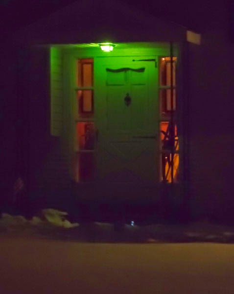
There is a light across the street from my house, and it is in such stark contrast to the other lights that it holds my attention. It provides a baring like that of the north star and a unique brilliance. At first I did not know that there was a literary connection between a green light and the sentiments (i.e. sense of longing and hope) that held sway over me. However, I was not surprised to find that a similar light is featured prominently in F. Scott Fitzgerald’s The Great Gatsby and it has much the same impact. This is discussed on NPR’s program Fresh Air with Terry Gross. In the segment How ‘Gatsby’ Went From A Moldering Flop To A Great American Novel, Gross illuminates the charged meaning of the light.
“The Green Light”
At 11 minutes and 56 seconds into the program Terry Gross states “one of the most famous things about The Great Gatsby is that Gatsby is always looking across Long Island Sound at the dock where Daisy lives. And he sees the green light that she has on at night on the dock. And he’s always looking at that light and yearning for his dream – for her.”
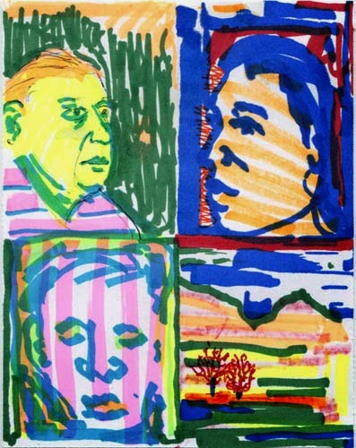
Gross makes it clear that a beacon can shine more than literal light. With a mind willing to venture to emotional realms, the light symbolizes the meditative place and connections needed to bring forth insight and far reaching speculation. Prior to my conscious knowledge of Fitzgerald’s green light, I began to created my own homage to this emerald glow. This was an exercise not just to test out a range of greens but to call on feelings I did not yet have words for.
Kip Deeds, Homage to the Green Light, Watercolor, Ink, Acrylic Paint, and Collage
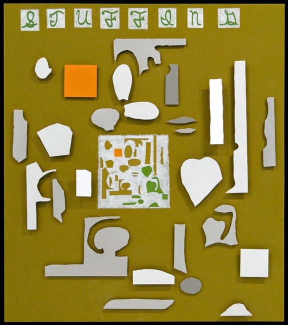
The following are my offerings for the last day of the Facebook art challenge. Two of the works were created because I was tempted by a commercial for the Roto Zip. The commercial made it seem like you could cut shapes in wood as easy as cutting paper with scissors. Initially I wanted to cut shapes out of wood for relief prints. However, while at a residency, I became intrigued by the shapes of the scraps from my collage work. Putting the best scraps together, I decided to recreate them in wood. This is the only time I used the Roto Zip. However, I had many fun outings to Lowe’s while making these sculptural paintings.
I called the scraps “Stuffing” and the first work has this as the title. Also included is a work in progress view of Stuffing. The second image uses the the leftover shape from cutting out the “stuffing”. It looked to me a bit like Great Britain and I had liked Billy Bragg’s song “New England”. I particularly liked the song because of the way he said “a new England” rather than “New England” (another place altogether). This is a simple but big difference. So my piece is titled A New England.
The last work shown here is a drawing/ painting where I use the shapes from Stuffing. It is titled Spring Training.
Kip Deeds, A New England, 42″x 23″x 2″, Acrylic & Collage On Wood, 2009
Kip Deeds, Spring Training, 16″ x 12 1/4″, Watercolor, Acrylic, ink, & Collage, 2009
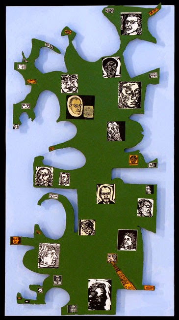
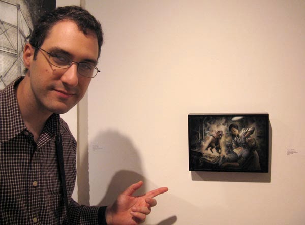
Lastly, I nominated Marcus Howell for this challenge. Marcus and I hung out and made prints for three years at the University of Illinois 1998-2001. Marcus’s work is often dark, but he is a skilled draftsman and printmaker who has a distinct perspective about social justice that he applies to his narrative work (also see Sue Coe). Those that are corrupt or suffer from vanity do not escape their moral short comings. Below I am pictured in front of one of his printed works.
Kip with Marcus Howell’s artwork
Marcus Howell, Magical Apparition, Mixed Media Mono-print
Originally on Facebook, the theme of this challenge was characters I either invented or further developed. There was a requirement to post 3 images of artwork a day for five days and end by nominating another artist to do the same. However, two of the images I had shown were previously documented in the post “Phil Poppin and the Return of Mr. Wisor”. In this case I will feature the third image, which was Sophia.
While the name Sophia is associated with wisdom, additionally this was my grandmother’s name. Upon reading about Sophia, I found that for those that do not understand wisdom Sophia takes on the appearance of a haggard old woman where as her beauty becomes more apparent for those who understand wisdom.
Kip Deeds, Sophia, Ink and Collage, 2014
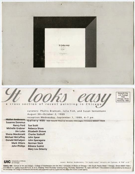
Next, I nominated artist Walter Andersons for this art challenge. In 1997 I drove out to Chicago for the first time, Walter was among several people that saved me. I had very little planned. Walter, barely knowing me, spent a free day with me and took me around town in style.
Below is a post card I have kept pinned to my bulletin board since 1999. The front features one of Walter’s paintings. Andersons’s art often features meticulous studies of photocopied source material (often art related or text). This study then gets coupled with an abstract background. In this case painting ienlivens what one may consider a degraded source (i.e. the photocopy) that may be a reproduction several generations from its source. Walter’s paintings offer qualities and observations that are both reflective and altogether new. Fragments are amplified and given new room and life.
Front (painting by Walter Andersons) and back of exhibition post card from 1999
I am glad to see that Walter now has a website where images of his paintings are studiously archived.
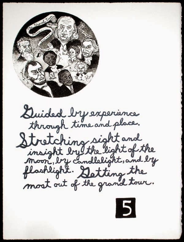
My Facebook art challenge day 3 featured performance art. This work was not made specifically to be exhibited. The drawing/painting/collage was made for the joy of seeing possibilities. The work presented here had holes cut in it, and the holes become planets, worlds, or vistas that can be seen as it is held up. I took the drawing outside, clowned around a little, and had pictures taken of me with it. Along with the planet drawing, is a ball of paint I have been building and liken it to making a planet. It is built like a snowball from my leftover acrylic paint. The last image here is likely what inspired the others. It is one in a series of fifteen prints. It includes a circular etching made on a plate that Sharon Massey gave me. Who wouldn’t want to make a circular etching if you were given a cut copper plate? Below are the four images I posted for the challenge (I needed an extra image of me clowning around).
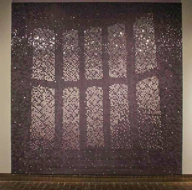
As a part of the challenge, I next nominated Richard Barlow as well as metals artist Kit Burke-Smith. Although these artists have yet to take up the challenge, below is an image by Barlow and here is a link to a recent interview with Burke-Smith (Kit is also on Etsy).
Richard Barlow, 120″ x 120″, Media: sequins and latex, 2015
We use cookies to ensure that we give you the best experience on our website. If you continue to use this site we will assume that you are happy with it.Ok