J. Todd Allison and Joe Moccia: Views From Another World

(To learn more about the “Viewfinder Project” see the original post.)

Since I was young, I have been interested in stories about how a distant world may come in contact with our everyday life. Recently, I read a book by Gary Lachman about the German spiritual leader and philosopher Rudolf Steiner. At a certain point in the biography Steiner receives hidden knowledge from a person identified as the “Master”. One gets the feeling this mysterious person is either part fiction or comes from a different dimension. It has also been intriguing to hear a recent interview on NPR with physicist Brian Greene who discusses the possibility of parallel universes. Although Greene speaks about plausible science and does not indicate how parallel universes may interact, at the very least his discussion allowed me feel as if my intuition has some connection (if not distant) with concrete data. These visceral feelings are related to the way that art is able to revealed worlds that exist beyond our humdrum routines.

J. Todd Allison, “Viewfinder”, 6″ x 4 1/4″, 2006
 

Both J. Todd Allison and Joe Moccia sent me “Viewfinders” that point to uncharted worlds. Allison’s painting (seen above) seems to combine body organs with mechanical parts and what looks to me like a woodpecker. All of this occurs amidst floating bubbles and a blue background. I can’t help but feel like this is an interior scene and this is a world within a larger body. In this regard, I thought of the 1966 film Fantastic Voyage. In this film individuals are miniaturized and travel through a human body.

Joe Moccia is a graphic designer who now works with motion graphics in the Washington D.C. area. However, when I was getting to know Joe he had an obsession with robots (he is also a bit of an inventor). His painting/ pen and ink drawing (seen below) seems to be an extension of his interest in science fiction. The strange cloud made with iridescent paint appears to be an alien life form or U.F.O. that can shift shape.

Joe Moccia, “Viewfinder”, 6″ x 4 1/4″, 2006

Viewfinders: Persistently Red

(To learn more about the “Viewfinder Project” see the original post.)

Kip Deeds, “Viewfinder”, 6″ x 4 1/4″, 2005


After receiving “Viewfinders” from other artists, I began to think about the suggestive nature of the image initially sent out (seen above). The image sent was printed with two layers. First, a red was printed on white paper and then black was printed on top to provide detail. Given its saturation and contrast, the red had a powerful additive effect. I wondered if this choice influenced the recipients because much of the artwork returned was dominated by red. The approaches varied but the results were persistently on my mind.

Red is associated with dramatic appearances in nature (e.g as seen punctuated in the landscape in the form of flowers, as see in fleeting moments as the sun sets, in the details of a fire, or as blood when we are cut). Red has come to symbolize a sense of passion, vibrance, and at times danger.  Perhaps for this reason red is also associated with other temporal states such as when one blushes or when one is angry (one can “turn red” and one can “see red”).

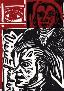
John J. O’Connor, “Viewfinder”, 6″ x 4 1/4″, 2005


I can only guess at the system John J. O’Connor  used to devise his “viewfinder”(seen above). O’Connor often uses complex data and text to point out highly directed and individualized results. He attempts to visualize mass information using his own idiosyncratic methods. Through his process he creates an abstract picture that in its wholeness captures a transcendent image. 

Although John O’Connor’s artistic labor is serious, there is also something humorous and ironic about it. When his work uses information of a more politically volatile nature, he seems to be making light of officials who use statistics in selective and less than credible ways. Regarding one of his recent works, John O’Connor states how he used the “largest rises and largest falls in the history of the stock market, connected according to my own invented system. I juxtaposed and connected this structure with statements of great confidence and insecurity, revealed through hypnosis.”

Anne Stagg, “Viewfinder”, 4 1/4″ x 6″, 2005


Anne Staggs’s “Viewfinder”(seen above) refers to sewing and work stereotypically connected to women. However, Stagg’s sewing is not exactly the kind one may expect, the act is not about fashion or decoration but more about keeping “it” together. On her website, when referring to a related series of paintings, Anne described her initial inspiration “comes from a chore that my sisters and I were given when we were young. In order to prolong the life of our socks, my mom asked us to repair the socks that were wearing thin. We stretched them over a bare light bulb and darned them with sock yarn.” 

Stagg’s paintings are unlike the “Femmages” (a kind of feminist collage using fabric) that Miriam Shapiro made in the 1970’s. Even though there is a relationship, one has to look harder to see the fabric (what is there both literally and figuratively). The white in the image is also intriguing because it is not the fabric. The white is the unknown icy hot light. In this case the viewer is shielded (or protected) and stitched inside a red sock.

Jason Urban, “Viewfinder”, 6″ x 4 1/4″, 2005


Jason Urban re-contextualizes commercial modes of production and often identifies imagery common in popular and mainstream culture seen through these modes. Urban gives prominence to the background content and details of reproduction processes (e.g. halftone patterns, screen savers, and raster images). By making the pixels more noticeable or by layering information in unpredictable ways (e.g. reproducing a screensaver image that is re-assembled on filing boxes) Jason allows us to consider what we usually overlook and see how this content can have new meanings. What I find compelling about the painting Urban returned to me (seen above) is that it appears unfinished. By recreating pixels by hand and by letting brush marks show, individual parts become prominent and interrupt a collective effect. In a digital realm, at the pixel level, this would be improbable if not impossible.

Taking the repetitious use of red further (and perhaps a bit outside of the realm of this project), I was reminded of the persistent use of the word “red” in the 1978 pop song “I See Red” by Split Enz.  Although the artwork I received did not make me hopping mad, the song offers a humorous comparison between lyric and music on one hand and visual art on the other hand. The underlying psychological impact of this color makes itself present in manifest ways.

Billboards


This past spring I entered a contest where artists could submit designs for a billboard. There was a prescribed scale artists had to consider, but the was no limit on content.  I spent a weekend making three designs. My original idea was to make a very small print large and then offer commentary related to the imagery. Initially, I used rubber stamps (these I carved) to make small prints. After the prints were scanned, adjustments and additions were made in Adobe Illustrator.


Ultimately, my plans were rejected. However, I feel that the sayings and imagery offer something to consider.  Perhaps the traffic that passes through this site will give the billboard designs greater consideration than viewers might if they passed actual billboards by car. The design at the top depicts the age of the internet, but ironically it is made in a way that alludes to what is handmade and personal. The middle image reflects our habits and how they relate to one’s desire to fit in. The bottom image follows the path of history and how information and vision have been passed from place to place. Of course each mode has it’s advantage and disadvantage. 

Christopher Davison: A View of Relief

(For more information about the “Viewfinder Project” click here.)


Several years ago I met Christopher Davison at his MFA exhibition in Philadelphia. After this exhibit, I invited Chris to make a “Viewfinder”. The drawing I received (seen below) led me to more questions than answers. Although illustrative, the image also seems somewhat atypical of Davison’s work because it is relatively minimal and focuses on a single subject. The figure or form that Davison presents does not fit a neat characterization. Is it a depiction of a machine, is it a creature, or is it some tree or natural formation? It seems to be spouting out steam which initially caused me to make a mental leap to my memory of Old Faithful.

Christopher Davison’s “Viewfinder”, Size: 6″ x 4 1/4, 2005


As my teaching position this summer came to a close, my sense of Christopher’s drawing had evolved. I began to see his picture more specifically as a metaphor for a kind of exhale of relief. I feel that Davison’s view is not so much of an object but more of an illustration of a feeling that transcends a complete description. No matter what job one has or what stresses life presents people need a means to “blow off steam”. This enables one to recharge or to heal. To “blow off steam” does not necessarily imply destructive or self-destructive acts, but it does indicate a limit and a change of course. In the case of individuals it indicates our physical and psychological limits.

In comparison to Davison’s other works, he often uses layers of active drawing marks in a variety of media. Ultimately, this provides his drawings with a kind of psychic energy. For example, within many of these drawings figures that may not appear to be in motion may also appear to pulsate. In contrast to the “Viewfinder” (seen above) that provides an exhale,these drawings are like the energy one receives following the deep long breath. Below is an example from Christopher Davison’s website.

Christopher Davison, Cronies, 11″ x 15″ · gouache on paper, 2011